

Introduction
In websites, CTA stands for “Call to Action” or “Call-to-Action”. They are the actions that the product owner wants their customer to do. We usually see CTAs as attractive buttons or links that might make users click.
Let say you are CEO of a startup and going to build a website from the beginning. CTA is one of the first things you need to consider when designing your product.
In short, CTA is the shortest way, and the happy case you want your users to go through your website. For example, on an e-commerce website, you will want users to click the “buy” button as much as possible, right? It is a typical example.
Why CTA is important
Web user behaviors are not like reading books. They have no reason for reading everything you have or scroll from top to down to see all the below content. They scan, search, click on something, and repeat until they find what they need.
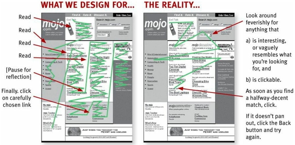
There is much evidence that shows almost web users do not stay more than 15 seconds on a web page. That’s an insane truth. Almost we have no time for reading everything on web pages, we just click highlighted buttons with large spaces around them.
That behavior makes CTA important to the web experience.
Other than that, in fact, we want users to click to buy our products instead of just see and quit, obviously right? So the more attracted CTA, the more clicks, lead to more conversion in analytics.
So in conclusion, CTA is the shortest and most minimal way to drive users to your desired flow without caring too much about the other things.
Designing CTA is not an easy job
It is best if you have a clear flow for CTA from the beginning of the product designing process. You will now want to change something that leads to analytics result become inaccurate. The more time you spent on researching your targeted customers, the more quality CTA flow you have.
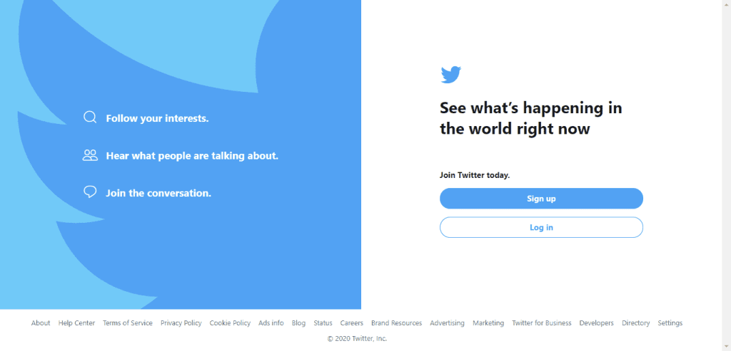
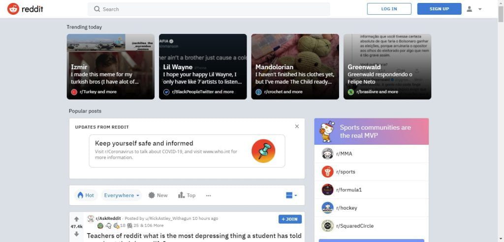
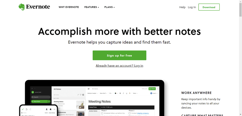
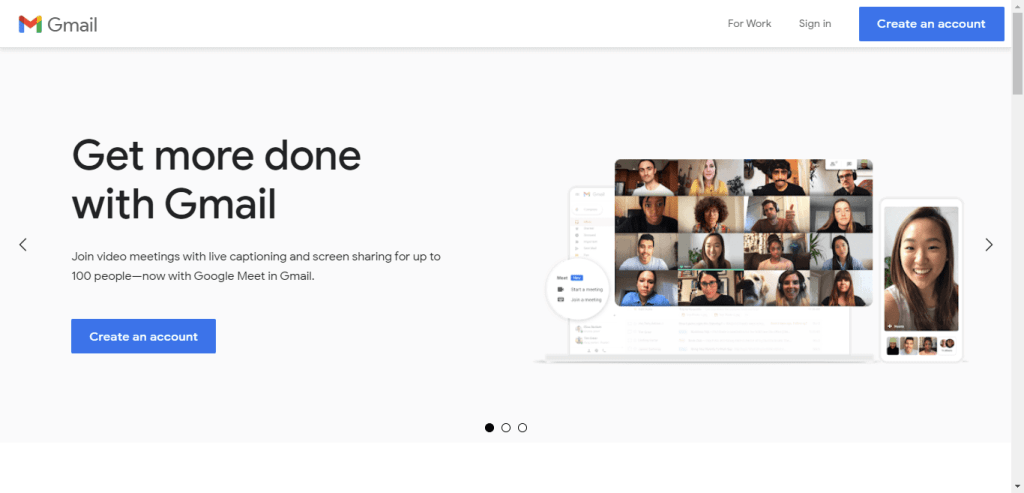
Fortunately, there are lots of popular websites that have succeeded in designing good CTA. Below are some examples from popular websites which I have divided into three different groups:


They need to be more considered than they look right? There is no one rule for every case of CTAs. You need to find out by yourself what is the best fit for your product. Fortunately, at least we have some guide that I will talk in the next section, and many use cases from popular websites, too.
How?
There are two questions you may ask now?
- How to design a good CTA?
- How to know if they are good enough?
Obviously, good CTAs usually have some of these features:
- Visual: has large spaces around them, larger font size, attracted color, and some animations.
- Words: short and no risk (a free trial is a good form).
- Position: easy to click or touch (on mobile devices) or consistent position (like a sticky header).
- Timing: as soon as possible with instructions to make users clearly understand what happens if they click them, or before users exit the page.
And if you want an easy way to make sure your desired CTAs are good to go, try this: ask somebody else. If they can realize the CTAs for the first time they see, it seems to be good. But of course, we need the A/B testing for usability and the analytics result eventually. That’s all we need.